Here at Lawrence Davis, we pride ourselves on hard work and dedication, which can be shown in one of our latest and greatest projects, Moddershall Oaks!
Moddershall Oaks came and asked us to help expand their ever-growing business and we happily accepted the challenge, mind-maps were created, debates were had, and meetings were held until we came down to the decision that the website needed to be revamped.
After a few months of transferring content and images, as well as adding brand new information, the website was finally complete and up for review.
When reviewing a website, we take the steps seriously, as we always want what’s best for the client. Everyone within Lawrence Davis gets involved in the process, as well as the clients and we all make individual notes and potential changes we’d like to see.
Now, designing a website is a difficult task, especially when there are a wide variety of services and products that needed to be added to flesh the website out even further. The term “good design” is often tossed around, but what is a “good design”?
Basics of a website include things such as:
- White space,
- Colour,
- Navigation,
- Positioning and alignment,
- Mobile-friendly,
- Typography,
- Usability
But amongst that short list are subcategories which we will dive into in today’s blog post!
So, lets start with the most obvious one, does the website look professional?
If your website is sloppy, plain or even homemade looking, then this can be a massive turn off to potential customers!
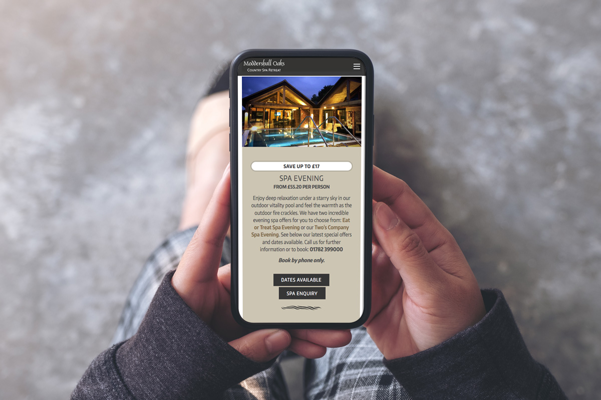
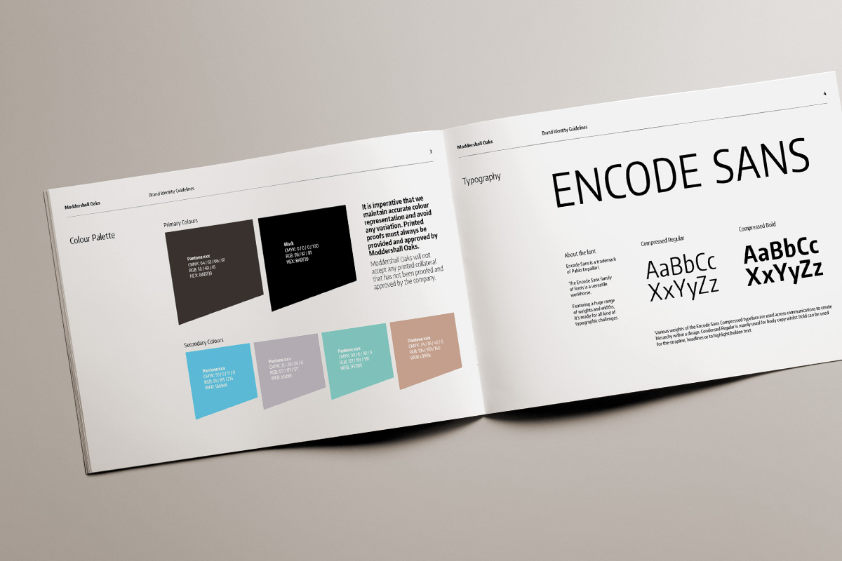
As I take my first glance through the website, I am happy to admit that the website looks professional and smart as it is following important themes such as a colour palette, template, font style and more!
The website is also very welcoming and kind to the human eye with its soft and calm colours.
Being secure is another big one, especially for businesses who are selling their services online.
I am happy to see and say that there is the ability to log into a guest account or the option to register an account online! Not only this but booking a spa day out is all done through a third-party website link meaning that the template is retained as a brand-new box appears on the page.
With web design, it is important to focus on getting straight to the point on what you want the visitors to do, that’s why its important to tell them what to do!
Straight away on the home page, I am prompted with last minute deals that are available. This is exactly what I mean by telling the visitors what to do as it states “…a great way to treat you or someone you love to a truly special experience…”.
I am pleased to see that every action is met with a reaction on what YOU can do to take that next step into booking your perfect getaway!
Testimonials are a good way to tell people how good your company is. Not only are they first-hand accounts of how good your services are, but they will catch the eyes of those who are new to your site and possibly wanting to use your services and products.
Most people nowadays use social media and it is often where you can find most businesses too, and one business that is making use of their social media accounts is Moddershall Oaks.
They heavily promote their Instagram in the footer of every page along with links to other available social media streams such as Facebook, Twitter, Pinterest and LinkedIn. Social media can also be taken advantage of in the terms of increasing website traffic!
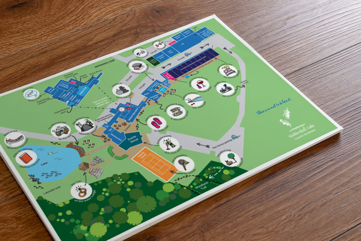
Overall, the website is filled with amazing content which varies greatly from page to page offering the user a different experience with every page they visit. Pages such as gifts, the wellness centre, news and contact are all listed and provide a different and unique style of information, images and more.
Moddershall Oaks also has miraculous loading times where there will be hardly any waiting time between each page, and that’s even a feat of accomplishment considering how many pages are currently sitting on the website.
The menu system is also versatile as it can adapt between different screen sizes including phones, tablets, desktops, laptops and more! Not only that, but it condenses itself into a burger style menu to prevent itself from taking up too much room on the screen!
Overall, in our opninion, we are happy with the outcome of the website out and how well the links are working as I have found no errors such as dead links or misspellings whatsoever.
if you would like to know more about our services such as design, branding, marketing and more, then you can check out this handy link!
Here at Lawrence Davis, we hope you have a stunning week!
The LD Team x
